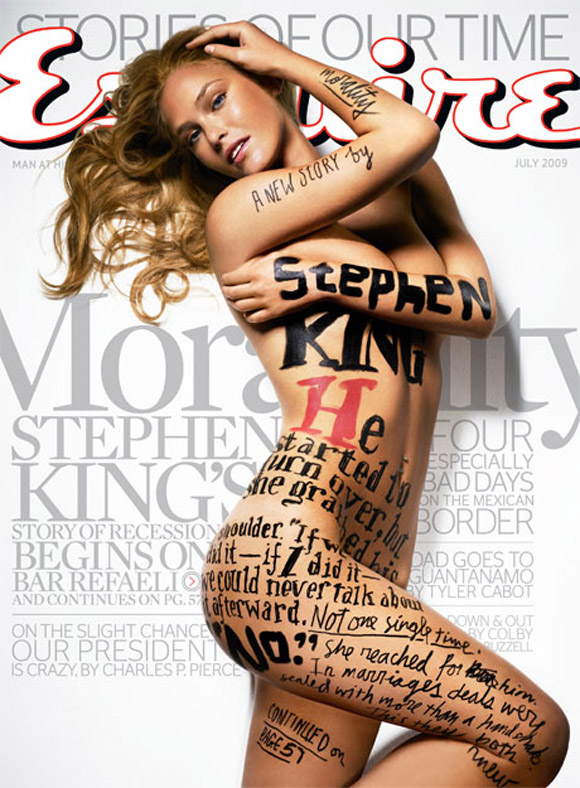
 I was thinking about type and stumbled across this image. It is the cover for Esquire magazine. I'm not too sure who the model is but she is not exactly important as this point in time.
The type on her body looks like it was painted on but very sloppy. The type in the background looks to great compared to the figures panted on the model. It has great opacity, the kerning looks to be perfect, the lack leading between the words seem to be intentional and I have to admit that it works.
I noticed that on the right side of the model, most of the font is sans serif while most of the type on the left is serif. The effect is interesting and kind of looks like the designer is creating shadows using wholly type.
This image can be found here.


No comments:
Post a Comment